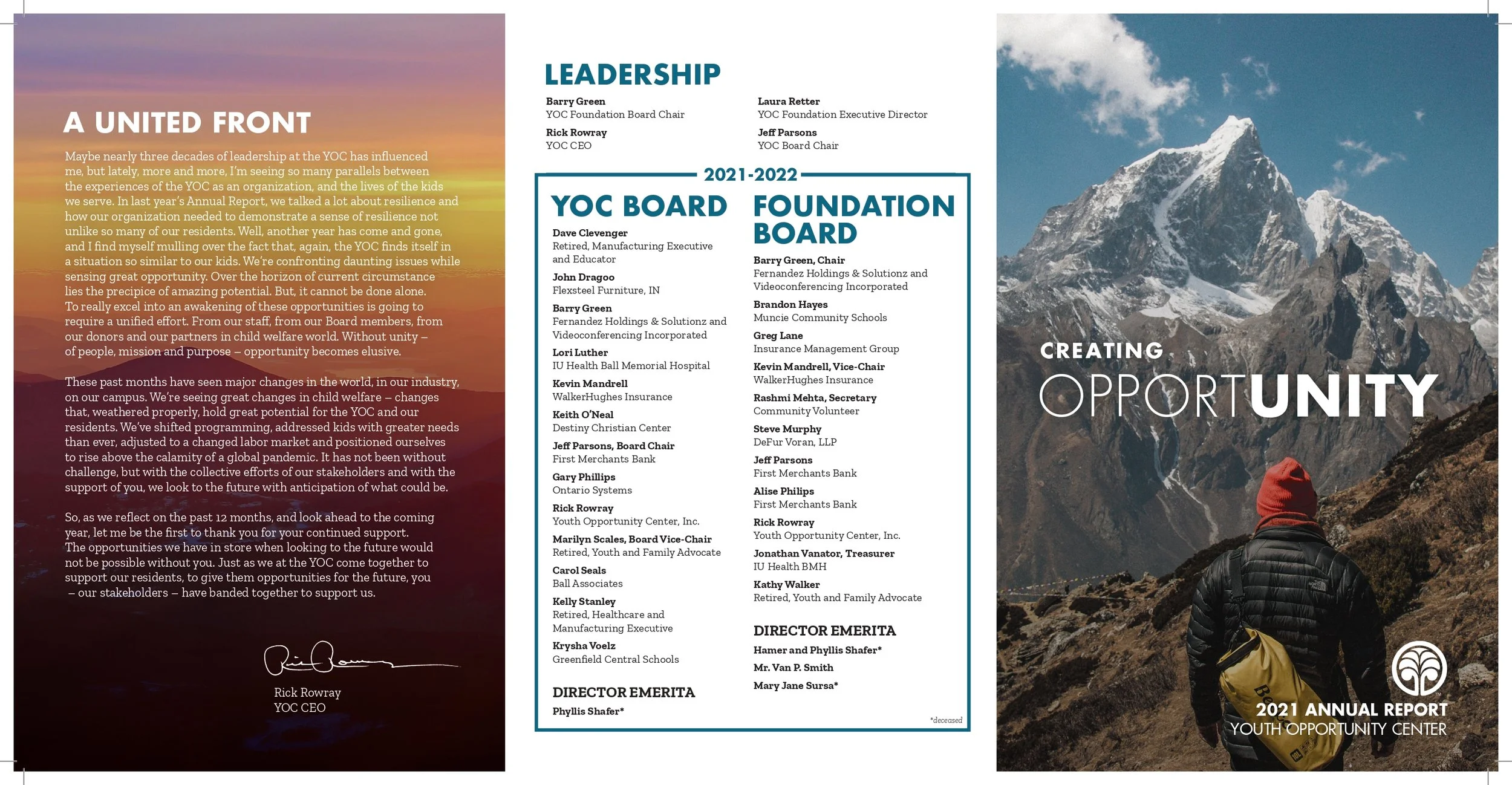
Expanding on a theme: how multiple pieces make up a brand
As the primary designer for the Youth Opportunity Center, I had the responsibility to keep their branding consistent across social media, annual reports, internal presentations, external promotion, events, websites, and more. Due to the sensitive nature of the youth they care for, we had to exclusively use stock photos or photos of their facilities. To combat both this and the negative stigma they face from facilitating troubled youth programs, we carefully selected photos that showed positive or neutral facial expressions. Nature photography supports the concept of bringing contentment and inner peace to those they serve, along with messages about growth and believing there aren’t “bad kids”. I kept their designs modular and put a particular focus on hierarchy since they didn’t want to compromise their important message.